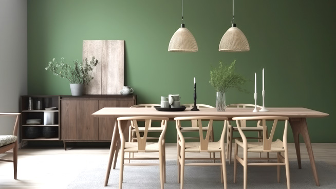
Our choices are largely determined by what we see others doing, whether in magazines, DIY programming, or the neighbors down the street.
But the question begs, who inspires those decision makers?
In 1994, writer James Woudhuysen made a statement to the effect that “whoever controls color, controls the world.” Sounds a bit farfetched until you think about it.
Back in the ’80s, a chemist who owned a printing company named Pantone had the foresight to hire Leatrice Eiseman as a consultant.
Seems his company had issues dealing with the link between a New York designer’s specification for a specific color and the textile mill in Europe applying the proper ink or paint.
What Eiseman did was help to create a consistent and recognized system for identifying and naming very specific colors and shades.
This led to the creation of the Pantone Color Institute which she has directed for nearly four decades, and which has CEOs of large companies waiting anxiously for the annual announcement of the “Color of the Year” in early December.
Her duties also have her assigning specific names to more than 2,000 of Pantones 10,000 color swatches.
And those names matter. One olive-brown shade originally called “Drab” found success after it was renamed “Cumin.”
Whether a large corporation is looking for guidance for the color of a worldwide product that will sell billions of units, or the company leader is looking to update the walls in his dining room, Eiseman gets a call for her advice.
During the near panic of Y2K when everyone “knew” the world was going to collapse, the Pantone CEO ventured to suggest Eiseman create a color to give people hope as they entered the new century.
Eiseman realized color could be a source of joy and inspiration in troubled times and research had long since determined that color impacts consumer choices and attitudes in the marketplace.
She chose Cerulean Blue, saying that “everyone looks forward to seeing a beautiful blue sky”.
The resulting campaign exploded around the world and cemented Pantone’s hold on the belief they are the world’s color authority.
Her 2023 choice, Viva Magenta, inspired large companies like Motorola to launch products displaying that color.
A company in Japan even created a week’s worth of hospital scrubs in Pantone colors to help patients mark the passage of time during extended stays.
Consumer trend forecasting company WGSN released a study that indicated nearly one hundred percent of all buyers purchasing decisions are affected by color, from fast food containers to automobiles.
Colors are actually chosen nearly a year before their carefully selected release dates, and the secrecy surrounding product development rivals any spy thriller.
The potential benefit is huge. Benjamin Moore’s announcement of its annual choice, called Blue Nova, within the last few months has created an uptick in demand for the shade of four hundred percent.
Four major industries that are directly affected by color trends include fashion, home décor, cosmetics and interior design, which combine to account for more than $2.5 trillion annually.
The Guys have always believed that a fresh splash of color or an entire coat of professionally applied paint represents tremendous value in both the livability and marketability of a home.
Colors can be used to define, expand, and set the mood in spaces.
And if you grow tired of it? Simply call one of our professionals and have them overcoat with next year’s choice.
Professionals like those you’ll find at InsideOutsideGuys.com.


